Erewhon – Optimizing the Self-Order Kiosk Experience
ROLE
UX Researcher
DURATION
10 Weeks
TEAM
Individual + Product Designer Collaboration
SKILLS
OVERVIEW
Erewhon is a Los Angeles-based luxury grocery brand. $171M in profit, 10+ locations, all in Southern California. Tons of celebrity collaborations and a customer base that treats food as a lifestyle. By 2023, the brand was expanding, and a self-order kiosk was on the table. The question was whether it was worth to be launched.
CONTEXT
Is this kiosk ready to be Erewhon?
Erewhon is a Los Angeles-based luxury grocery brand. $171M in profit, 10+ locations, all in Southern California. Tons of celebrity collaborations and a customer base that treats food as a lifestyle. By 2023, the brand was expanding, and a self-order kiosk was on the table. The question was whether it was worth to be launched.
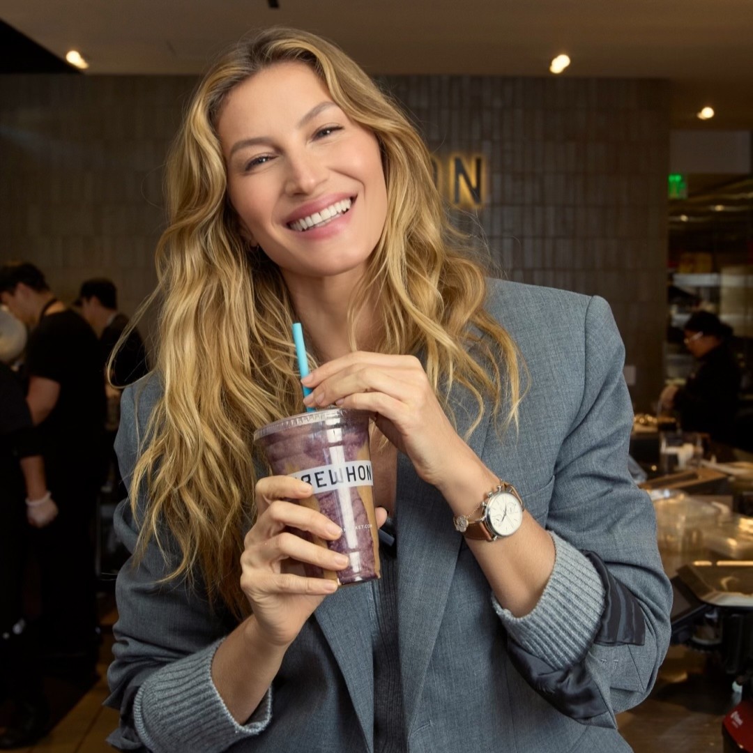

Celebrity collaborations: Gisele Bündchen and Lisa (BLACKPINK) Erewhon
PROBLEM
Erewhon doesn't do lines
Erewhon's reputation is built on excellent service and that's inseparable from the brand. But long wait times at the tonic bar were becoming a recurring problem. A self-order kiosk was the proposed fix. The question was whether it was ready to represent Erewhon. Based on the client brief, communicated verbally during project kickoff.

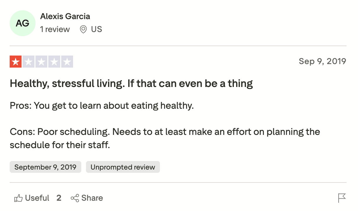
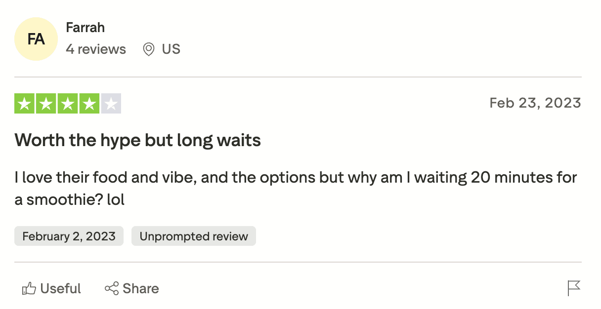


Customer reviews from Yelp and Trustpilot
OUTCOMES
Close, but not launch ready
Placed accidental orders. Direct operational risk at every location
Couldn't access coffee modifiers. Erewhon's core promise, broken
62%
Expected Quick Remove. Friction where Erewhon can't afford it
PROCESS
Three steps before testing began
Understanding the brand, 4 competitors, and ADA standards
Diary studies across Erewhon and 4 competitor kiosks
Prototype setup, recruitment, and test scripts for both testing rounds
Relying on ADA and hardware specifics
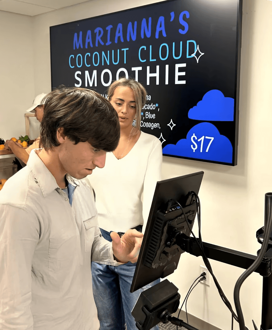
14 participants (4'11" to 6'2"). I tested how far they could comfortably reach, whether the screen caused glare in specific configuration, where misclicks happened, and which card reader position felt most natural.
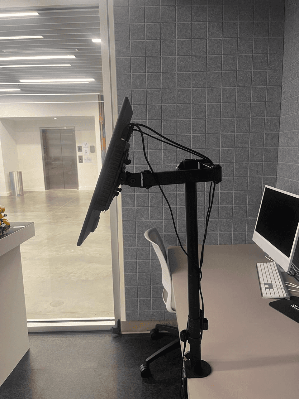
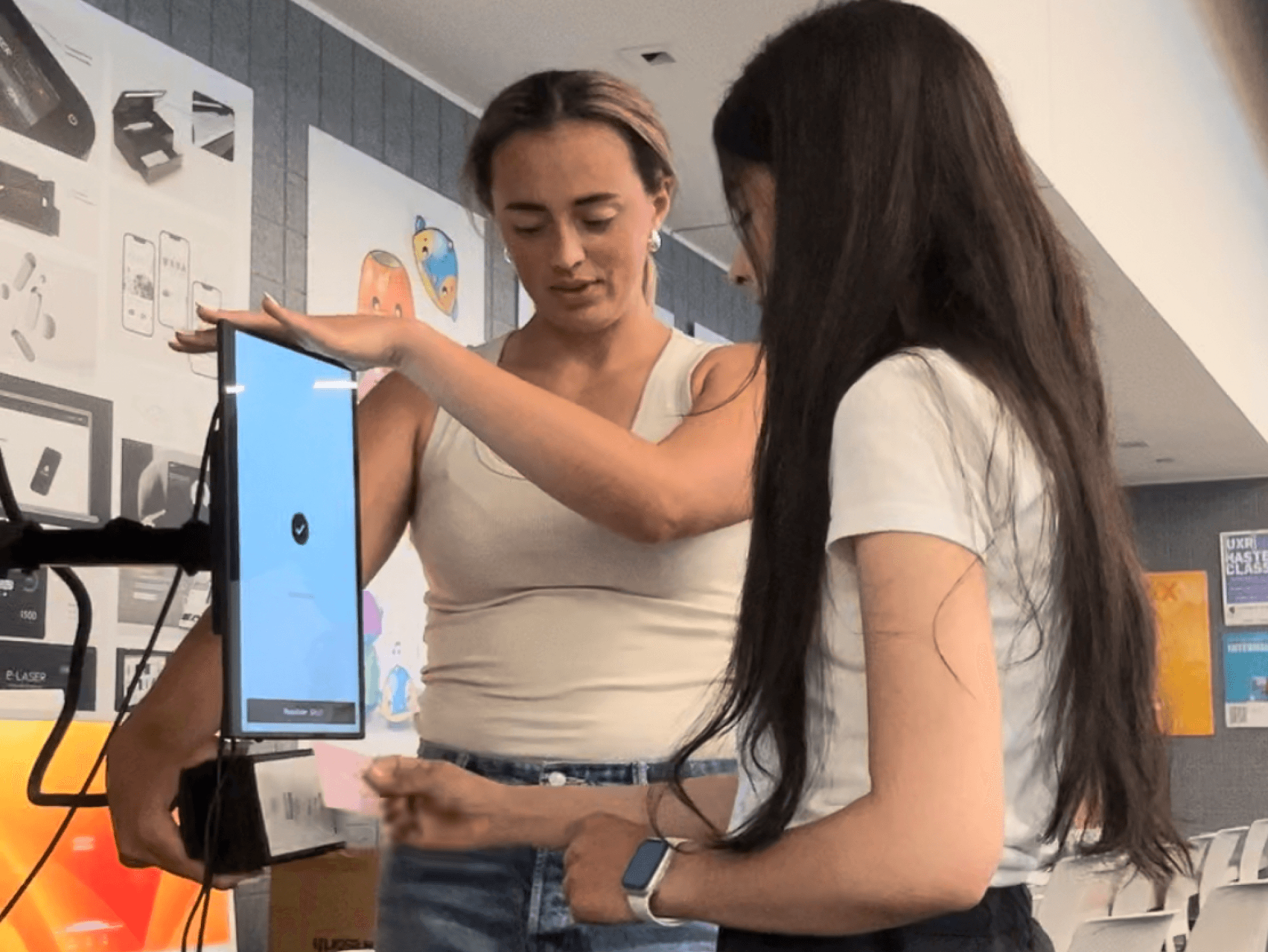
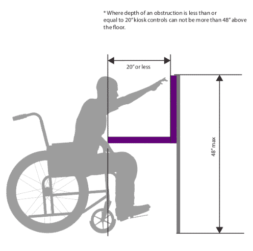
Testing setup, ergonomic prototype, me moderating the session, ADA kiosk requirements
Defining the core flows
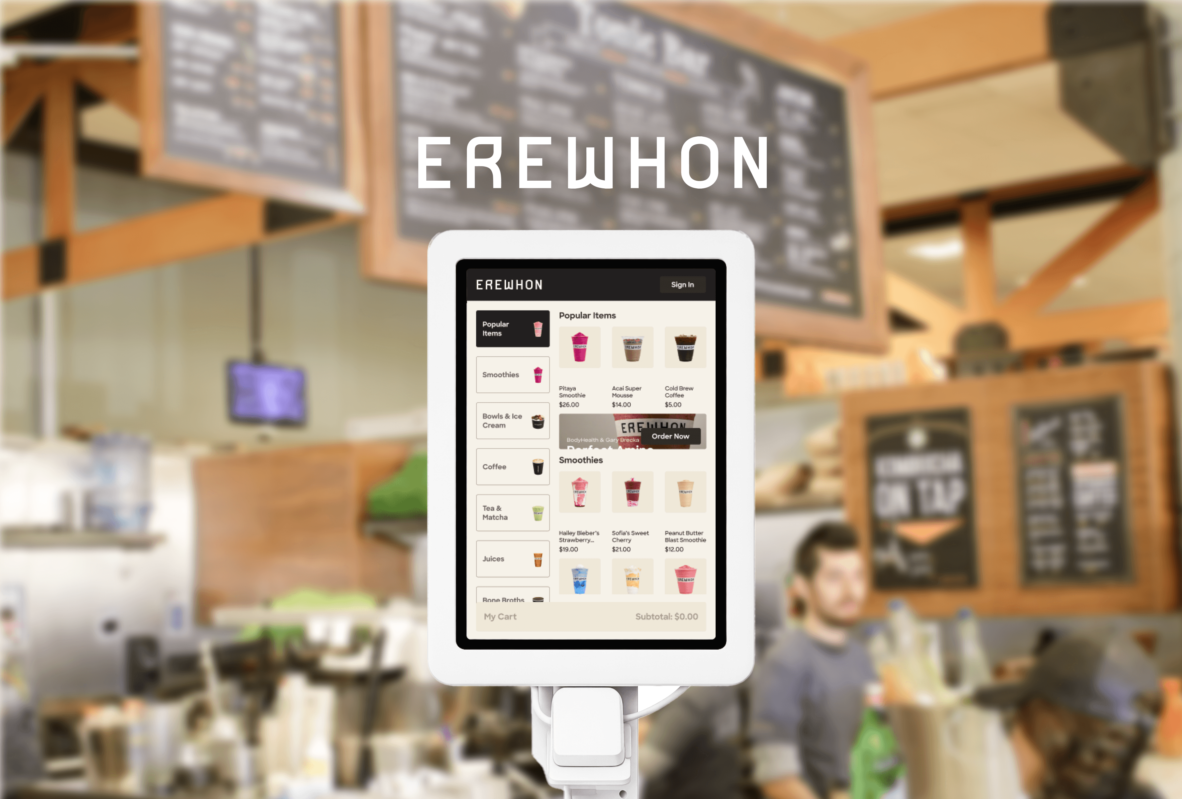
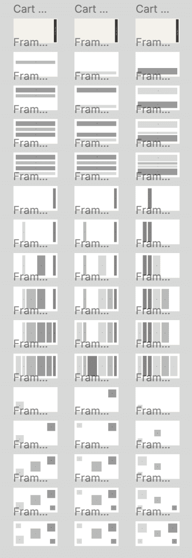
I started by exploring the provided prototype on my own to make sure everything worked. Then used my research to define what to test, core kiosk flows plus what makes Erewhon unique: navigation, quick add, customization, modifiers, SMS notifications, loyalty points, and cart management.
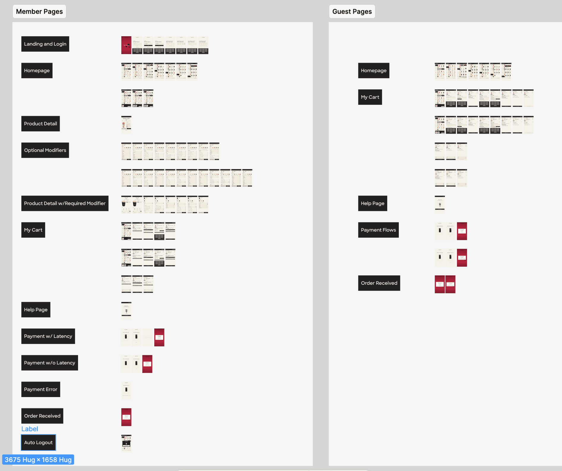
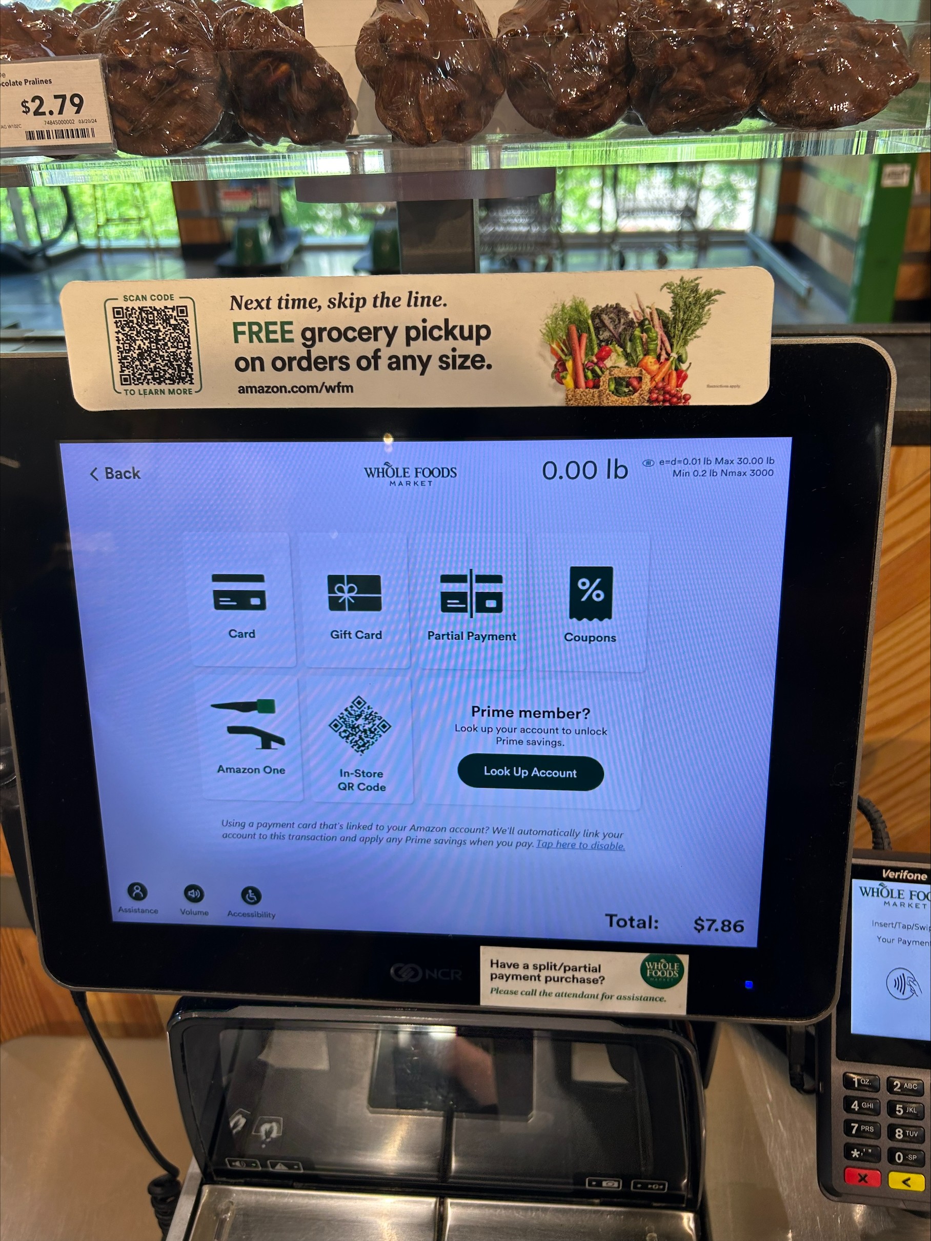
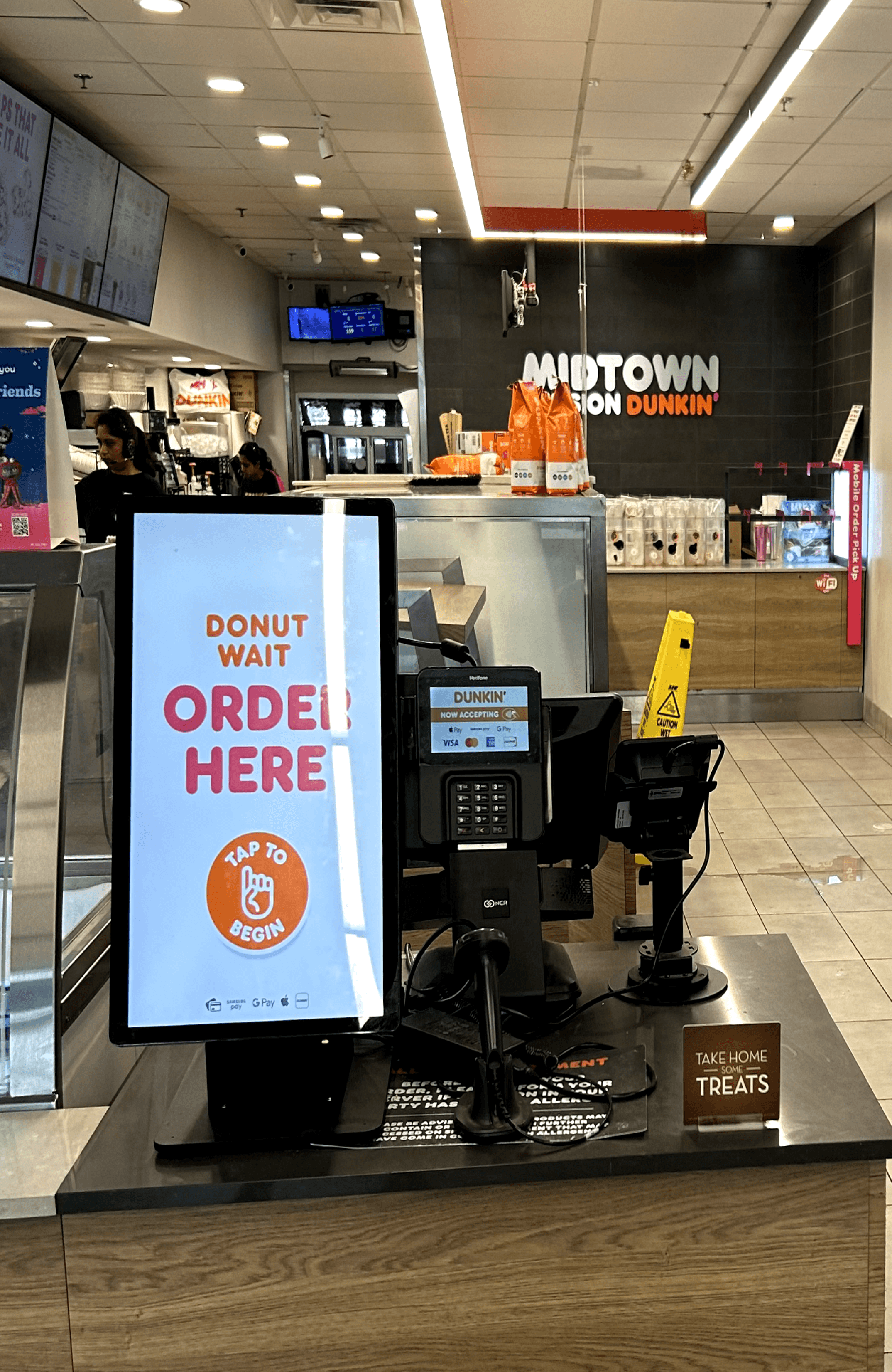
Snapshot of prototype, tested kiosks at Whole Foods and Dunkin
RESULTS ERGONOMICS
Screen height & angle
38% preferred 52" at 15°. The only configuration that worked comfortably across the full participant height range.
Card reader
39% preferred the card reader at 44" placed under the screen. The position that felt most natural without breaking the ordering flow.
Screen finish
83% preferred matte. Reduced glare meant the screen stayed readable.
RESULTS PROTOTYPE
Menu navigation
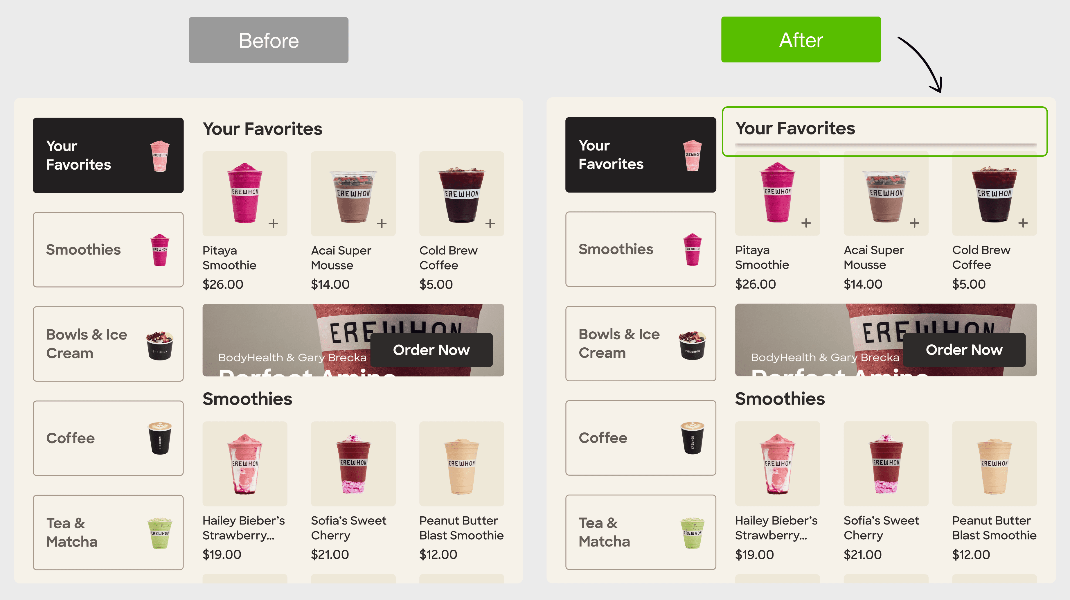
94% preferred browsing through the displayed menu, but only 79% completed product discovery. Users couldn't connect the left menu to the content on the right. Added sticky subcategory labels to clarify the relationship.
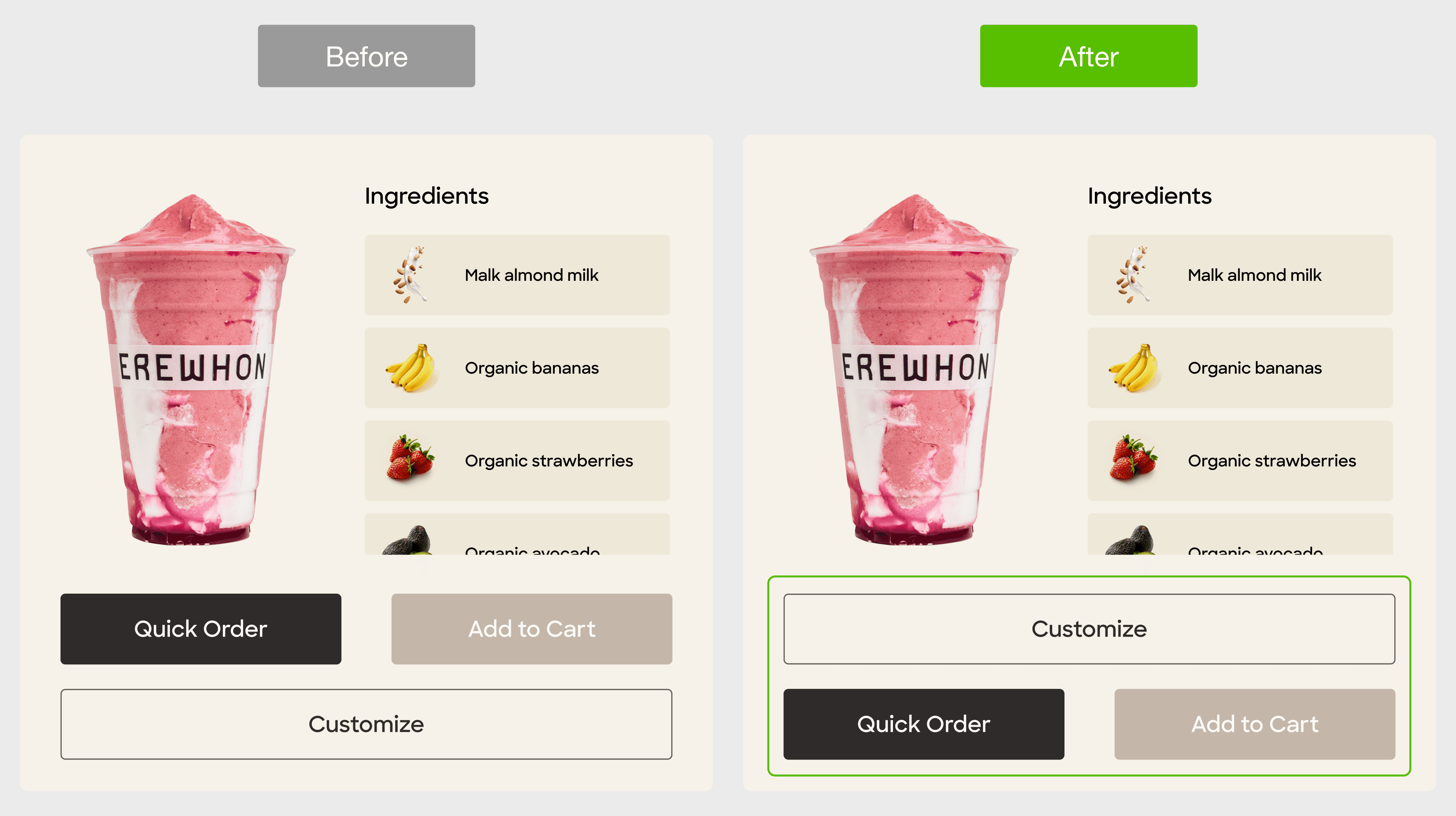
Customization flow
Only 51% completed the customization flow(Smoothie specifically). The Customize button was buried below checkout, participants simply ignored it. Moved it above to make it the first visible action.
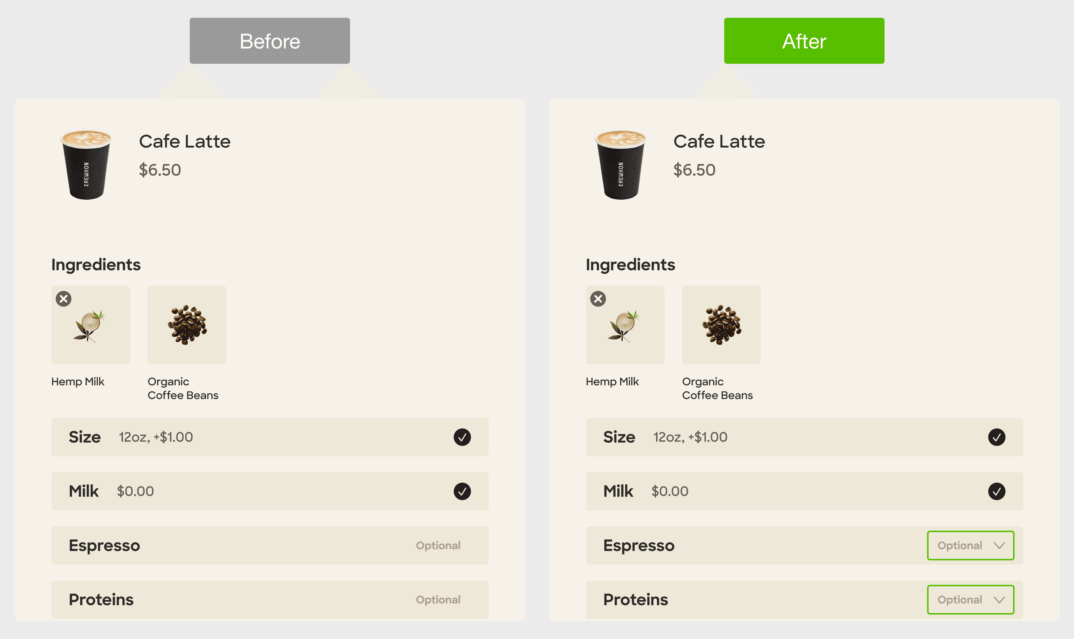
Modifier access
28% success rate(Coffee modification). Users didn't know the modifier rows were expandable. Added dropdown indicators to signal there was more to choose.