Meridian – Helping Non-Professional Cyclists Start and Sustain Outdoor Rides
ROLE
UX/UI Designer
DURATION
10 Weeks
TEAM
Individual
SKILLS
CONTEXT
Expense management is falling behind
Approving budgets, catching policy violations, forecasting whether a quarter closes in the red. It all runs through the same system every day. The average expense report takes 20 minutes to complete and still has a 1 in 5 chance of containing an error. At $1.2 trillion moving through these tools annually, that adds up fast.

One of the few tools showing efficiency as a metric. Ramp, 2024
PROBLEM
The first ride is where most beginners drop off
Choosing a route, understanding the challenge, and feeling ready all happen before the ride begins.

One of the few tools showing efficiency as a metric. Ramp, 2024
Looking across online and in-person sources
Researching outdoor activity trends
Interviewing and surveying non and beginner riders
Analyzing Strava and similar apps
OUTCOMES
>5 sec
Users identified route difficulty correctly, up from 24%
87%
Experienced reduced friction at ride entry
75%
Increased likelihood of completing the first ride
Based on two rounds of usability testing: 11 participants at midpoint, 8 at final
SOLUTION PREVIEW
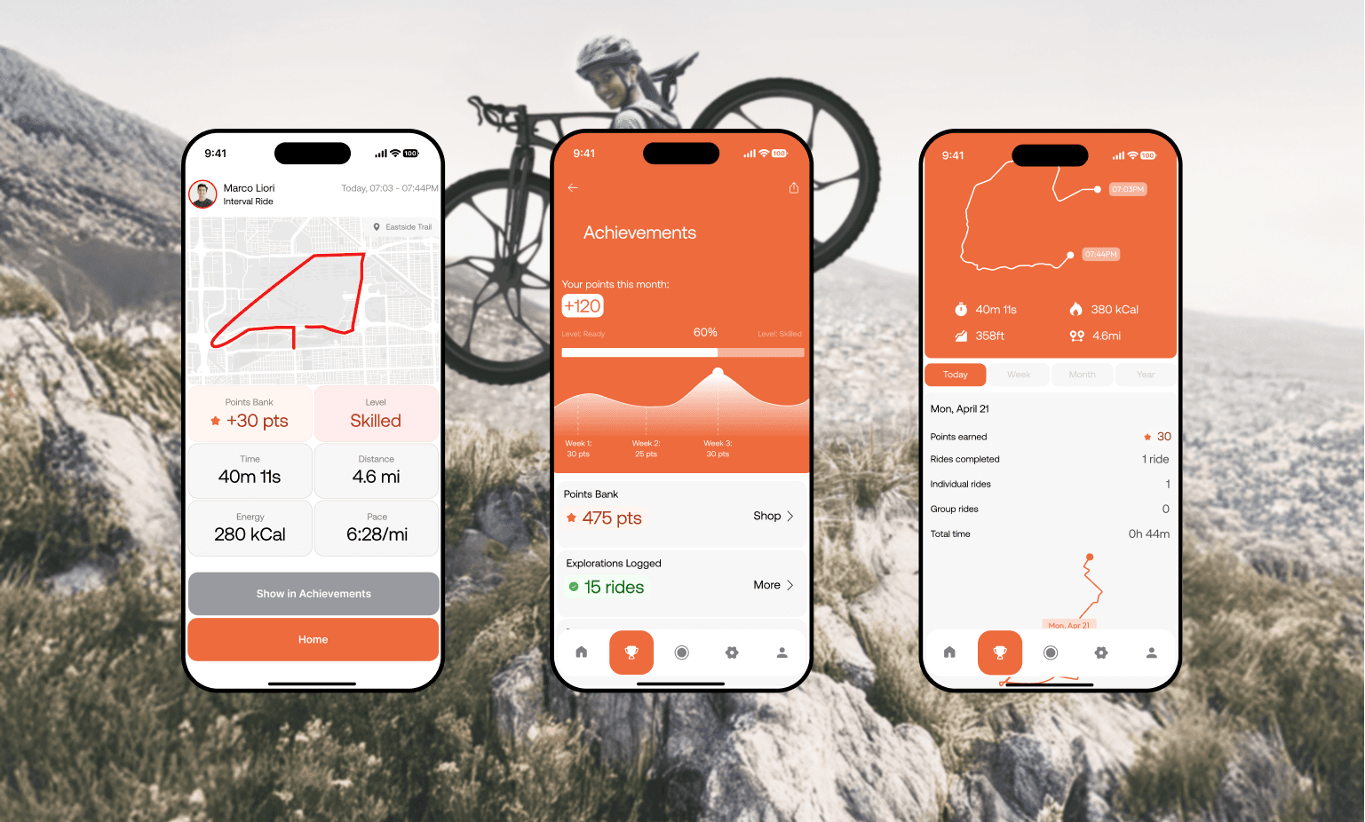
Reducing drop-off at the first ride through session clarity
RESEARCH
The market pushes performance.
Beginners need approachability
Most cycling apps are built for people who already ride. Fibra is built for people who haven't started yet.
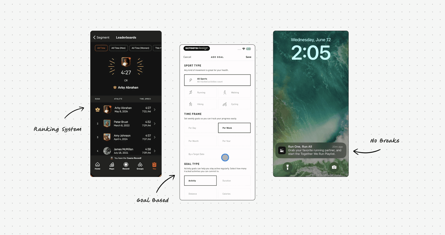
Interfaces from Strava, Nike Run Club and Adidas Running
People want to cycle.
The barrier is knowing where to start
User journey map, built from primary research before any UI existed.

DESIGN ITERATIONS
Early Wireframes
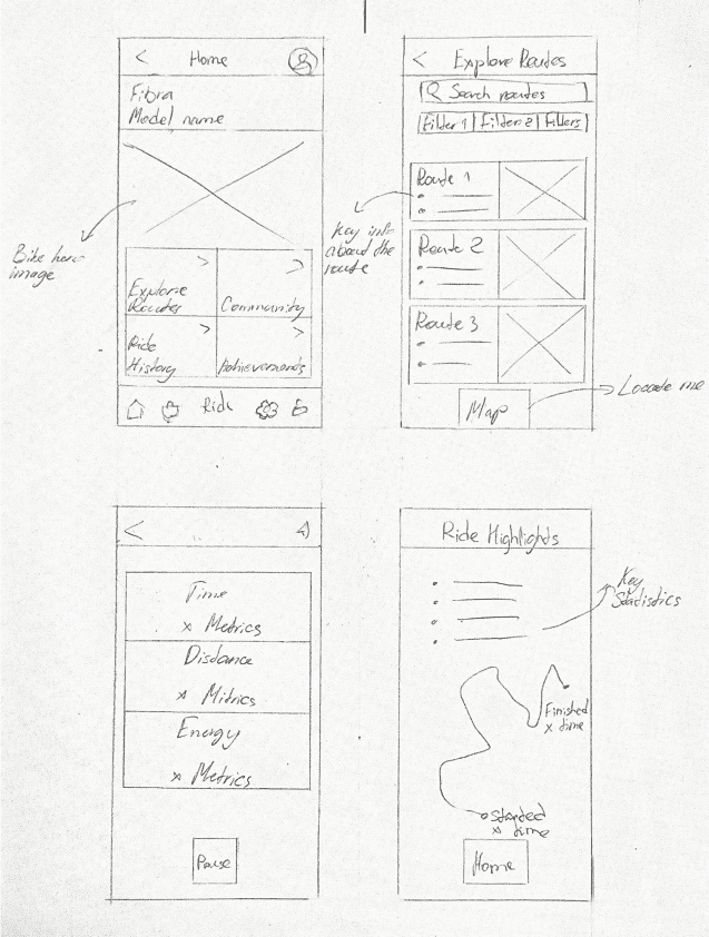
I explored how shapes and spacing could create a scannable, accessible presentation of the data, with the right visual hierarchy.
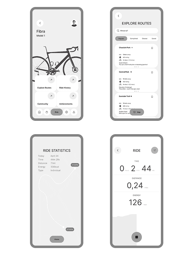
A pivot in direction required a pivot in design
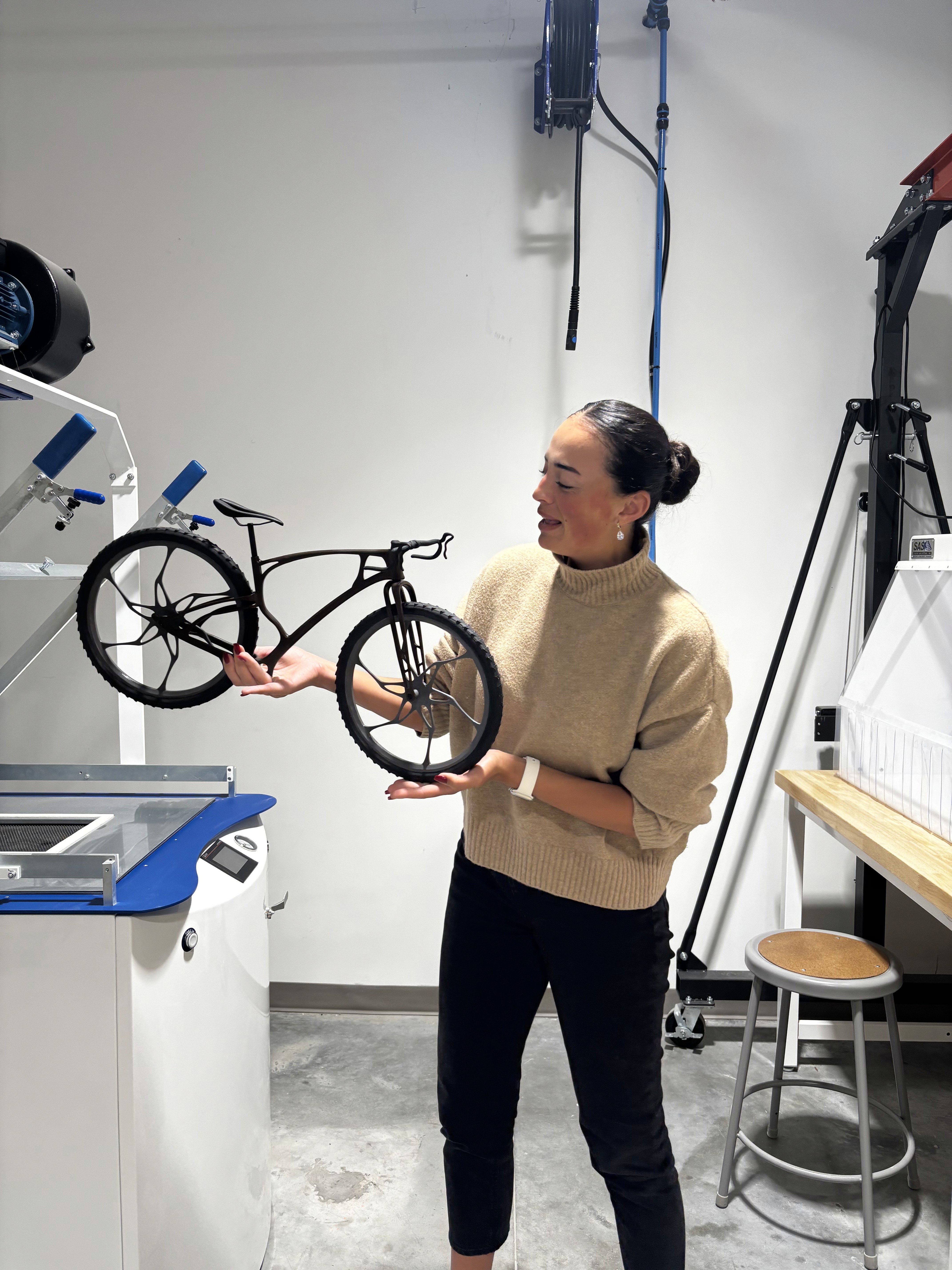
At the mid point the industrial designer had to change the bike concept. The downhill frame design wasn't structurally viable, so the bike moved to gravel. For me it meant a new user, different behavior, and a complete shift in emotional direction.
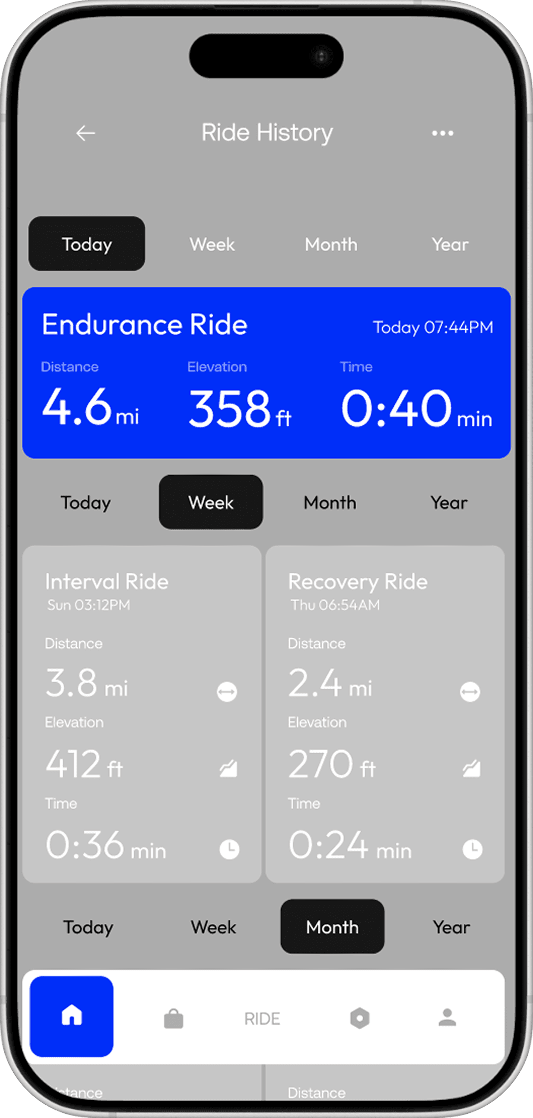
BEFORE
Performance-driven direction
Narrow audience, advanced riders, extreme conditions
Focused on progress tracking and precise performance data for those who already know what they want
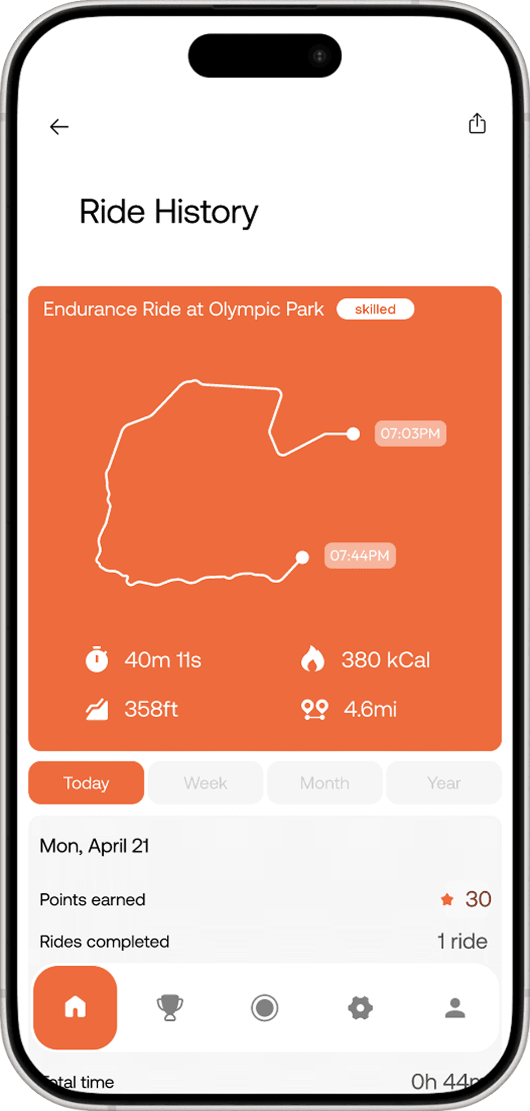
AFTER PIVOT
Approachable premium direction
Target shifted from experienced niche riders to non-cyclists and beginners
Focused on decision to start and riding consistency
Difficulty that anyone can understand
With the new bike direction set, I explored multiple visual directions. During testing, one decision stood out. How do you communicate 5 preparation levels to a user who has never cycled before?
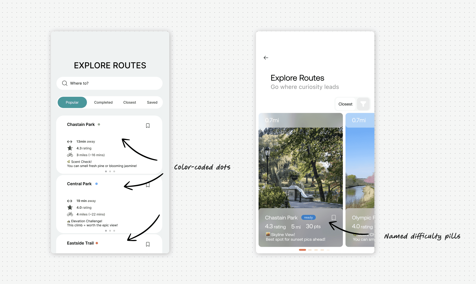
Route difficulty indicators across two versions
VERSION 1
Color-coded dots
Followed standard color psychology, green - easy, red - hard
Failed usability testing, completion rate 24%
VERSION 2
Named difficulty pills
Beginner, Ready, Skilled, Strong, Driven - read by any user
Over 80% of participants understood the levels immediately, up from 24%